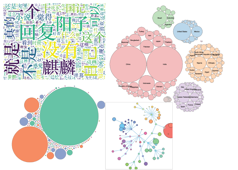
Since I finished the process of scraping data with Python from Bilibili website last week, I began to think about how to visualize them, I searched a lot and also talked with Professor Cairo and Clay to get professional advice. The truth is, professional advice means more and more work.
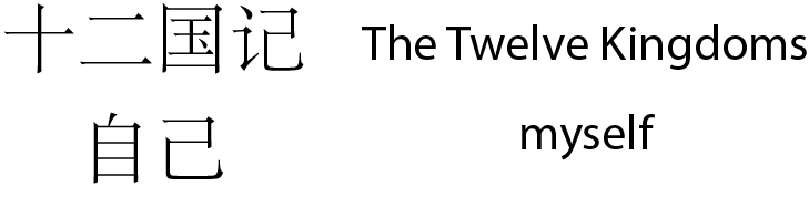
In the beginning, I wanted to use a wordcloud chart to visualize the frequency of the keywords in the bottom comments. However, I felt like a bubble chart might be a better choice. In WordCloud charts, the higher the frequency is, the bigger font size the word is. So longer words might look bigger than shorter words, even if they are in the same font size.The larger the bubble is, the higher the frequency is. It’s perfect to compare the different frequencies without the distraction of the length of the keywords. For example, “The Twelve Kingdoms” is longer than “myself”. It might influence people’s judgment.