From Ancient Cloth in China to Your Jeans
My Role
Designer Coder (Individual Work)
Timeframe
2019.9.12 - 2019.12.20
Link
Tool
D3.js Procreate Adobe Illustrator
On August 20th 2019, I attended professor Alberto Cairo’s Infographics and Data Visualization Studio course. We needed to individually develop a large visualization project in 4 months. I chose Chinese indigo dyeing as my topic. Many Chinese northern village workers relied on indigo dyeing for their livelihood last century. But their businesses were going up in flame, because industrial indigo was successfully developed overseas. It is much cheaper than hand-made indigo. In the early 20th century, Chinese indigo workers were also war-torn. To some extent, indigo mirrored the decline and revival of China. In this blog, I’ll be taking you through the long design and creation process of the project “From Ancient Cloth in China to Your Jeans”.
This project took me more than 4 months, and it's my first time to tell a story about Chinese traditional culture. It’s a huge challenge for me. but for people who want to know more about the process of data visualization, I hope it will be helpful. Thanks to professor Cairo and Lenny, I can’t finish the project without their help.
The Design Process of "From Ancient Cloth in China to Your Jeans"
The idea
In July 2019, I read an interesting history book, A Minimalist History of China in the Museums. The author, Jingwei Zhang, weaved the history into each story through cultural relics in the museums. In the chapter of the Qing Dynasty, I noticed the small blue fabric—Chinese indigo dyed clothes. To my surprise, the way of traditional indigo dyeing is the same as the way of modern jeans dyeing. The only different thing between them is the previous one is made by human hands, the latter one is made by the factory.
The small blue fabric caught my eyes. I did want to tell a story related to my motherland but also related to America. So, I chose it as my topic, proposing some keypoints I’d like to dive into: what is indigo dyeing, the history of indigo dyeing, the process of making indigo dyeing, today’s indigo dyeing from China to other countries. But the first question came, where is the data? Actually, this question puzzled me during the whole project. Because the data about indigo is thin and scattered, very hard to be visualized. In this situation, I searched as many as books related to Chinese clothes, especially about indigo, exports, statistics.
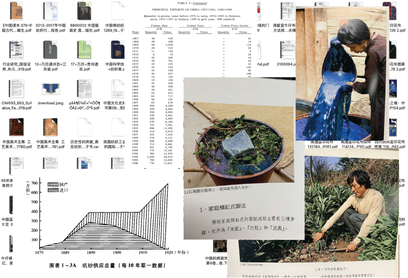
Parts of the Books I read
The data
After a sea of reading, I found there is data about the exports of cotton, wool and silk from China to the world, which was retrieved from the book, Statistics of China’s Foreign Trade During the Last Sixty-five Years.
And professor Cairo sent me an awesome link, the UN COMTRADE datasets. In these datasets, I can download over 100 countries’ detailed imports and exports from 1962 to 2018. I chose to show the total exports and the main five categories of exports in China and the USA to the world in 1962 and 2018.
In addition, I also found another useful website, the USITC DataWeb, which provides U.S. merchandise trade and tariff data. So I can download the imports of Chinese denim to the USA since 1996. With this data, I can compare the imports of Chinese denim to the USA in 1996 and 2018.
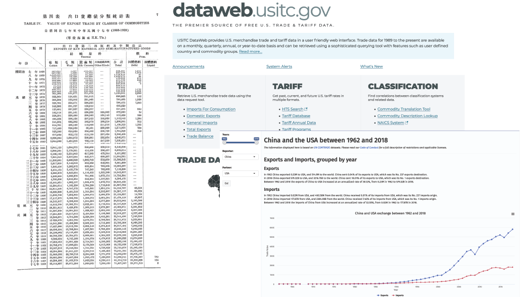
Data from book, UN COMTRADE datasets and USITC DataWeb
The design
During reading those books and data, I felt like it’s better to use the line chart to link indigo dyeing and Chinese history in the beginning. And it’s also a great way to draw the process of the traditional indigo dyeing making. I drew the very rough designs on my iPad to capture that idea:
Start with the line chart, then the process of indigo making (animate), then focus on the specific city—Nantong, which has a long history of indigo dyeing, the last part is the export from Nantong to the rest of the world. And I asked my friends in China to contact the curator of the Nantong indigo dyeing fabric museum. Because I read some book the curator wrote, he mentioned some data in the book. I wanted to get more data. Unfortunately, he replied to me with the data I already know. So I can’t create data visualization for Nantong.
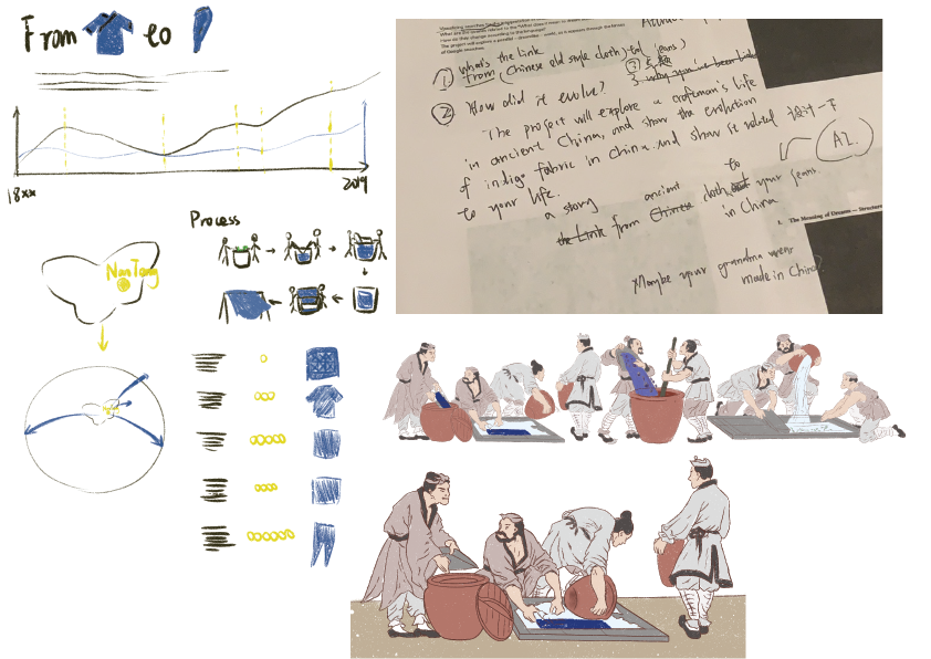
The hand drawing layout and the process of indigo making
The rough site
At the beginning of coding this website, I tried to firstly show the charts, then change their styles. So you will see some chaotic charts (´·_·`). They have different colors, different strokes, different opacities… I knew that, and at this step, I just needed the charts to show up.
And I also met the first challenge—treemap. Since I wanted to compare the main 5 categories of exports in China and the USA to the world in 1962 and 2018, I needed to create 4 treemap charts. I made line charts and choropleth maps in May 2019. And because I made them by d3v3, the old version, I just needed to transfer the charts into the d3v4 version. But treemap is totally a different thing. Treemap is related to d3-hierarchy. I was struggling with root, node, parent, child, and so forth. And nearly all the examples on the website used JSON files. But I was more confused after transferred my CSV files into JSON files, because they became messy, unreadable code. Even if the computer can read them, it added more troubles when I was debugging. They distressed me for several weeks.
Thanks to professor Lenny, he sent me the link of d3v4 treemap, after I told him my problem. I was so lucky! Follow this treemap chart, I successfully made my own treemap chart!
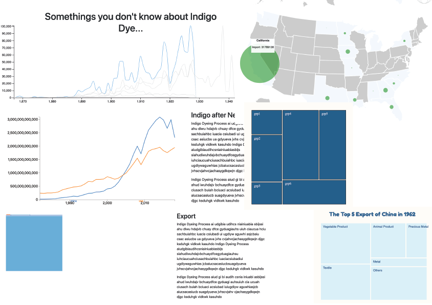
The rough versions of my charts. Right two are my treemap charts:)
The drawing
After finishing the D3 parts, I drew the process of the traditional indigo dyeing making by Procreate. If you want to know more about Procreate, you can see my another blog -- About Procreate. Then I used PS to animate it.
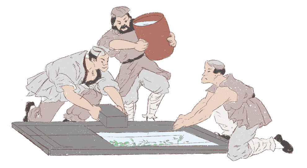
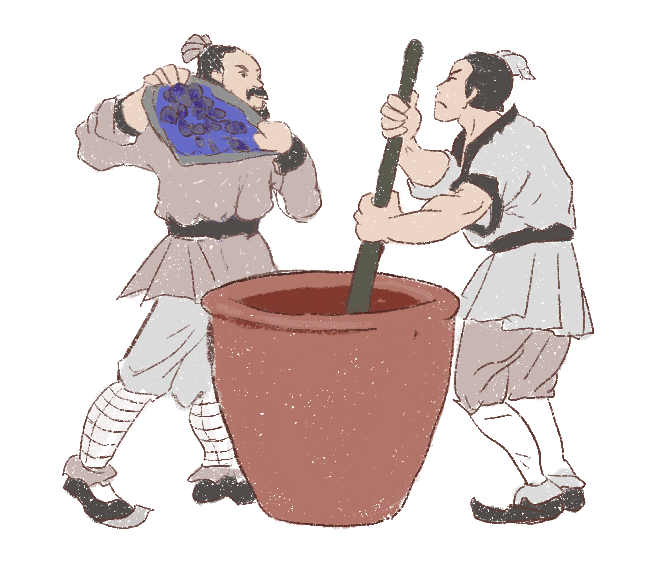
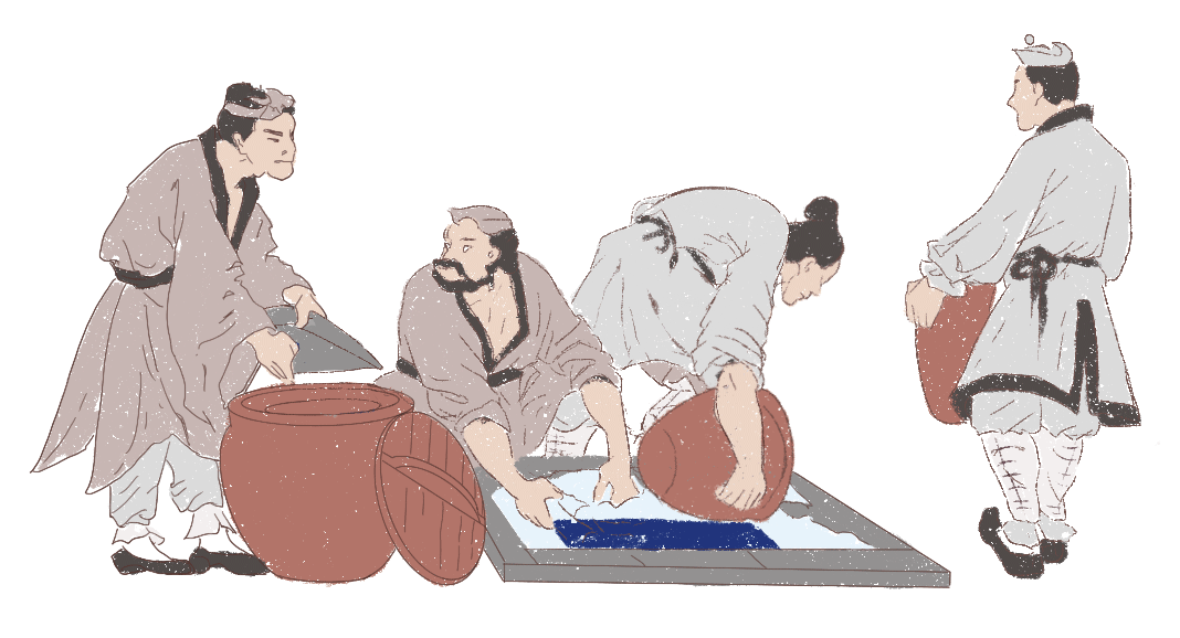
The animation of the drawing
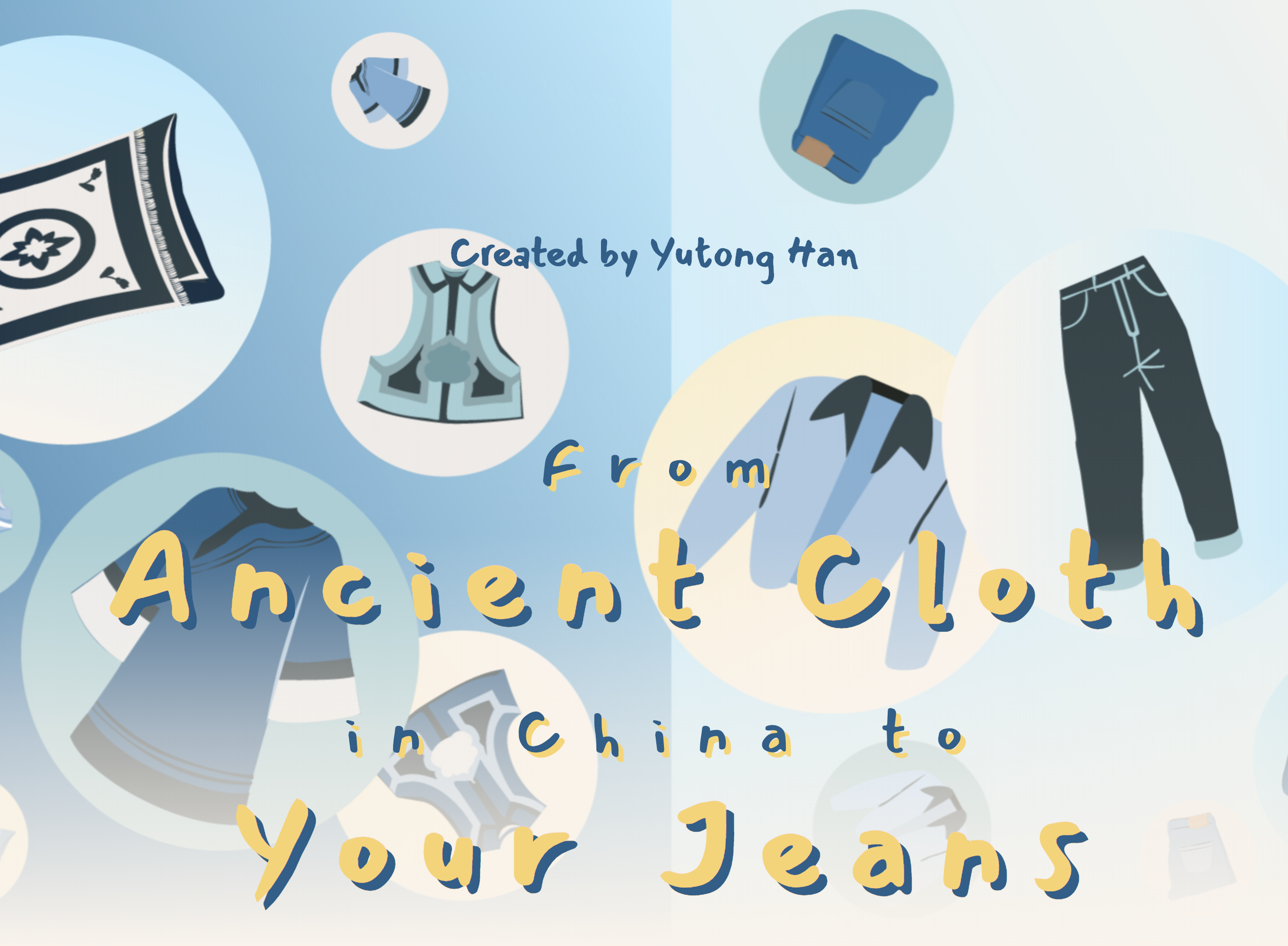
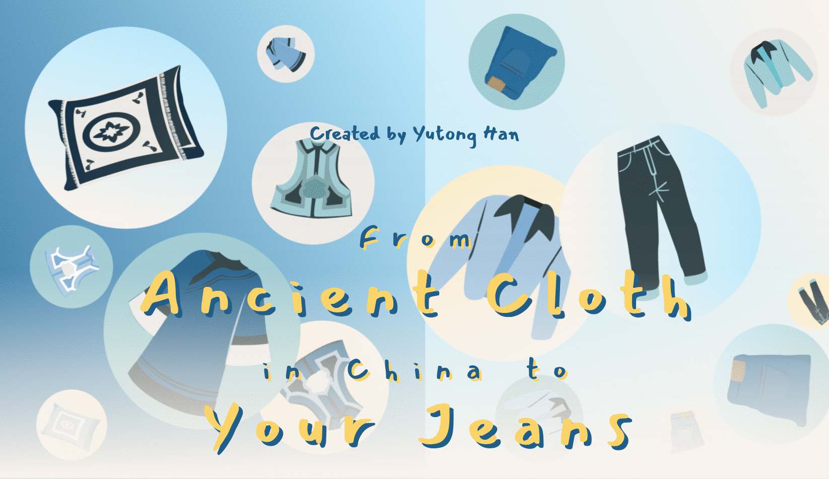
And I also drew the background image for my title. The left side is Chinese traditional indigo dyeing fabrics, including dresses, waistcoats, pillowcases. The right side is modern indigo clothes, including jeans, denim jackets, denim shorts. I added the white at the bottom of the image to make my title and subtitle more visible.

The background ../image
The style
Since I finished the D3 parts, it’s time to revise this website into a consistent style. Due to my sketch of the process of indigo making, I chose the sketch style. For the title, subtitle and chapter names, I finally chose Mansalva font. It’s a handwritten font, working well in different sizes (some handwritten fonts works badly in the small size).
As for color, of course, I selected blue as my main color. And I selected the orange, yellow and creamy white as my complementary colors. After multiple attempts, I found the following 6 colors collaborated with each other well~

The color palettes
The Interaction
Because I don’t want audiences to get tired while reading, I added some interactions to make them enjoy the reading. In the beginning, I added the effect of falling down from the top of the webpage for the title, in order to allow them to look at the background image first, then focus on the title. After that, the audiences can select an answer for the multiple-choice question, “There is something in common in these icons, can you find it?” In fact, every answer is correct. When they finish selection, the SpongeBob animation will pop up, and it will say, “Good job!” Why SpongeBob? Well, because I like it. And it’s yellow. I don’t forget to keep the consistency (๑•̀ㅂ•́)و✧
I also added the tooltips for each chart. So, the audiences can hover or click on the parts they are interested in to get more info.
The recoding for the interaction
Mobile friendly
It’s another challenge for me to overcome. To be honest, I’m not sure I have overcome this trouble, since charts become very small, hard to recognize and interact with on the smartphone. And I also tested many times with different browsers on Android, iOS phones. And they reflected different problems. Some I still have no idea how to fix them. And not just for phone, the requirements for a screen bigger than 600px and less than 1200px is different for desktops and smartphones. I spent several weeks to revise my website. Even today, I can’t say I finish this part. I still on the way. Fortunately, my hard work was rewarded.

The recording of mobile version
And here are my tips:
- If you want to make your project mobile friendly, separate your CSS style into the desktop file and the mobile file. Or you will face a chaotic CSS layout, very hard to find the place you want to revise.
- The margin, width, and height of D3 charts should not be actual px. I used innerWidth*0.1 or innerWidth*0.2 for margins. And I used innerWidth*0.8 and innerHeight/2 for chart’s width and height.
Final thoughts
- Ask the experts for suggestions. Last semester, I met professor Cairo twice a week, met professor Lenny once a week. I’ve said before but I have to say again, without their help I can’t make this project. Experts’ suggestions are so precious. I knew how ugly the original version is. So, I really appreciate their help.
- Constantly revise the project. Well, experts’ suggestions are great, but it also means a lot of work. Keep working. When I was revising, I “hate” those suggestions. But when I see the result, it is worth it.
- If you get stuck for a long time, turn to plan B. I was supposed to add scrolly-telling in my project in the beginning. But I was stuck for a long time. Then I used another way to achieve the goal. But I found it’s not very useful in this project. So, I deleted it. That often happens. Don’t stop at one bug.
Hope this blog was an interesting read for you! Here is the project link.